
In a world full of information and interfaces, simplicity wins. As designers, we constantly face the challenge of helping users make quick, confident decisions. One of the most valuable psychological principles that guide us in this process is Hick’s Law, also known as the Hick-Hyman Law.
Let’s explore how this concept impacts digital design—and how you can apply it to create smarter, faster, and more user-friendly experiences.
What Is Hick’s Law?
Hick’s Law states:
“The time it takes to make a decision increases with the number and complexity of choices.”
In simple terms, more options = slower decisions.
Originally studied in the field of cognitive psychology, this principle now plays a huge role in UX/UI. It explains why cluttered interfaces cause frustration, and why minimal, focused layouts perform better.
Why Hick’s Law Matters in UX/UI
When users are overwhelmed by options, they hesitate—or worse, they leave.
Here’s where Hick’s Law becomes your design ally:
It helps reduce cognitive load.
It encourages faster user decision-making.
It improves task completion rates.
It supports cleaner visual hierarchies.Whether you're designing a website, app, or dashboard, limiting and organizing choices creates a smoother user flow.
Examples of Hick’s Law in Action
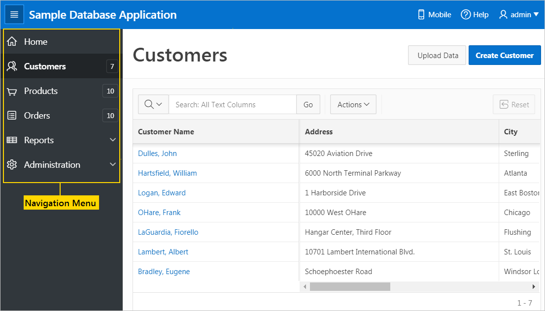
1. Navigation Menus
Imagine a homepage with 15 menu items. The user has to scan and compare before clicking—this wastes time. Instead, grouping items under 4–5 categories helps the user navigate intuitively.
2. Call-to-Action (CTA) Buttons
If your product page shows “Buy Now,” “Subscribe,” “Download Trial,” and “Learn More” together, it confuses the user. A single, focused CTA drives better results.
.webp)
3. Forms & Onboarding
Long registration forms often cause drop-offs. Breaking them into short, progressive steps (like “Step 1 of 3”) encourages completion and keeps users engaged.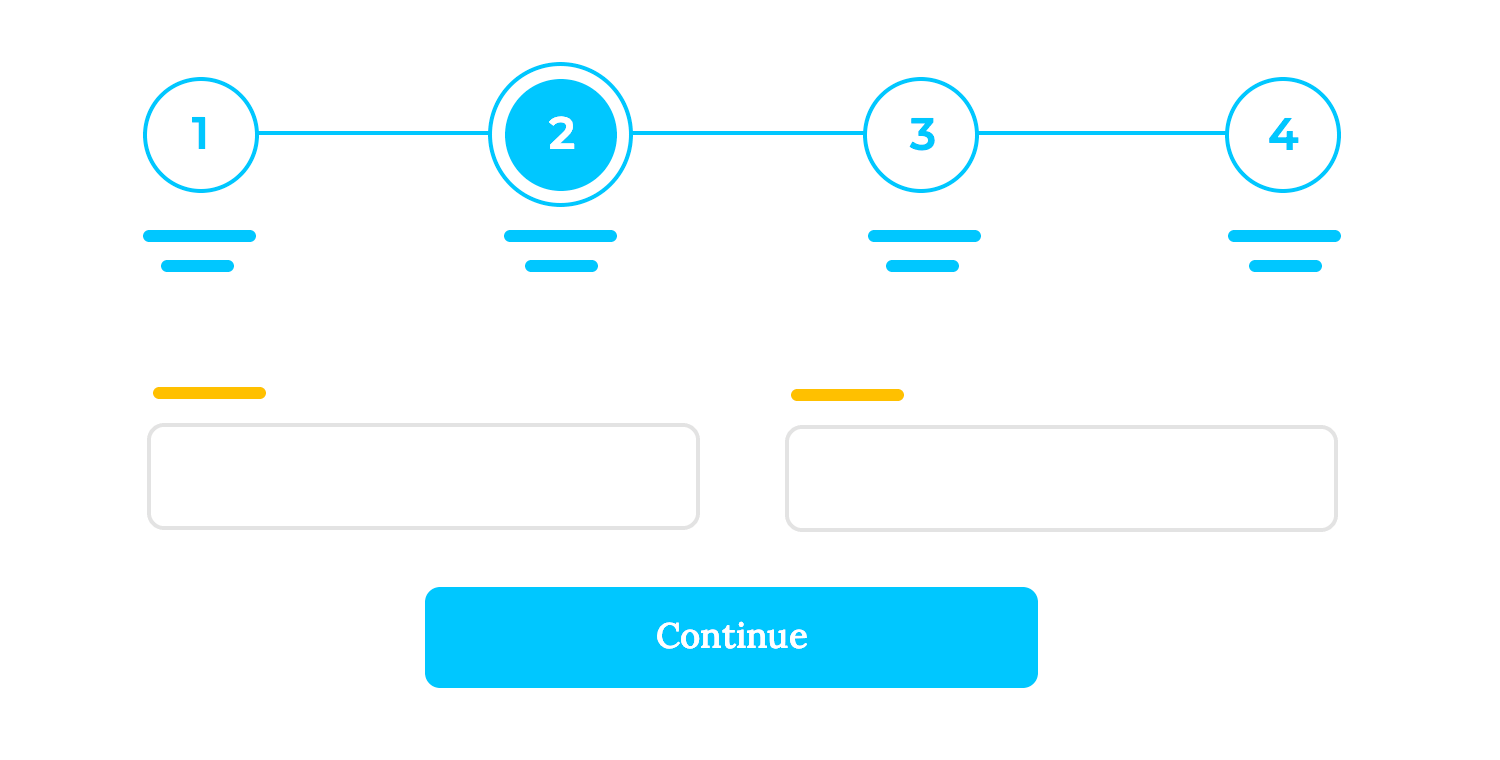
How to Apply Hick’s Law in Your Designs
Prioritize actions – Don’t treat all options equally. Guide users to what matters most.
Use progressive disclosure – Reveal advanced options only when needed.
Group similar content – Apply the Law of Proximity to organize choices logically.
Simplify the layout – Remove distractions. Use whitespace and contrast to draw focus.
Conduct usability testing – Identify where users hesitate or get stuck due to too many options.
In today’s fast-paced digital world, users crave clarity. Hick’s Law teaches us that too many options can paralyze action. As UX/UI designers, our job isn’t to give users everything—it’s to give them what they need, at the right time, in the simplest way possible.
Less clutter. Less confusion. More action.


0 Comments